Global style guide
Note: This design specification is still in development. If have any feedback or would like to join the PWA conversation, please join our Slack channel.
This topic provides the global style rules and values used in the Venia theme. Use this guide to style components that will fit within the Venia theme.
Layout
Grids
Grid layouts should be in multiples of 4 where possible, and
the gap, or gutter, between each grid cell should be in multiples of 8rem.
Borders
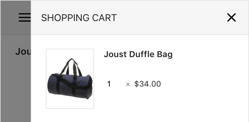
Use masks and borders instead of drop shadows to separate different sections and visual components.

Use the following values for borders:
| Property | Value | Description |
|---|---|---|
border-radius |
2px |
The roundness of an element’s corner border |
border-width |
1px |
The width of an element’s border |
Note: For buttons, the border-radius is half the height of the button.
For example, a button with a height of 3rem should have a border-radius of 1.5rem.
Layers
Avoid using z-index to re-order items; instead, rely on document order where possible.
If you need to use the z-index, ensure that it is only used to re-order sibling elements within a single layer.
Colors
Tip: Color values are expressed in RGB format because it translates easier to rgba() values than HEX format.
The Venia theme uses the following custom properties for color in its design:
| Custom property | RGB value | Usage |
|---|---|---|
--venia-border |
rgb(224, 224, 224) |
Border color |
--venia-grey |
rgb(246, 246, 246) |
|
--venia-teal |
rgb(0, 134, 139) |
Buttons |
--venia-text |
rgb(33, 33, 33) |
General text |
--venia-text-alt |
rgb(117, 117, 117) |
Alternative text |
--venia-text-hint |
rgb(158, 158, 158) |
Hint text |
Use the var() function to use these custom properties in your style definitions:
.myComponent {
  border-color: rgb(var(--venia-border));
}
Typography
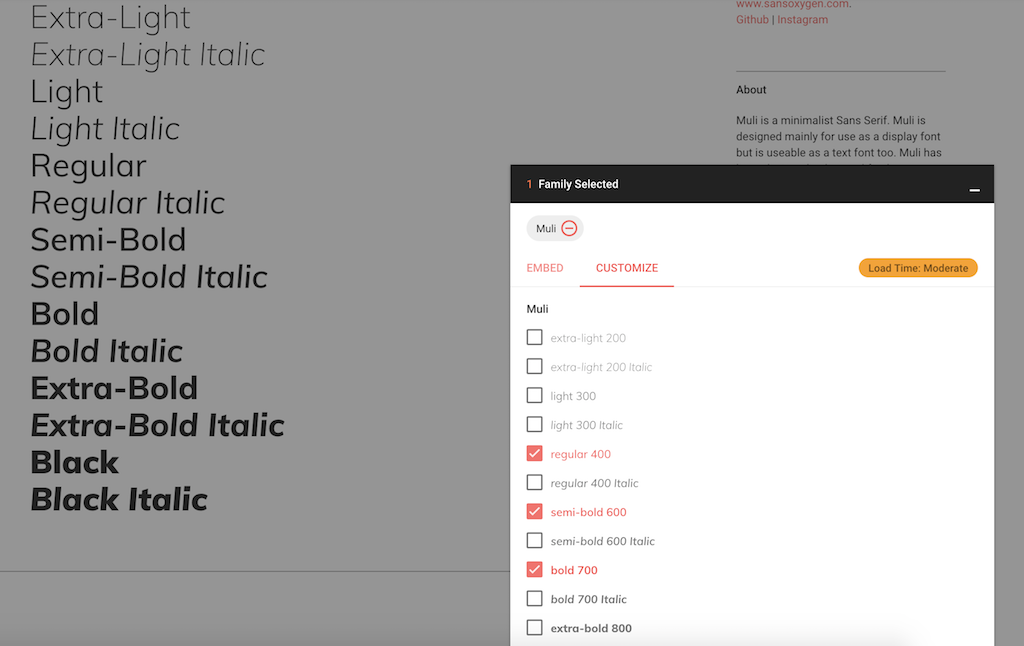
Venia uses the open source Muli font from Google in its design.
Note: If you are developing Venia themed components, you must install this font locally because the Muli font is currently not served by the backend server.
If the browser cannot find or use this font, it defaults to the following OS specific fonts:
- San Francisco for Apple users
- Roboto for Android users
- Segoe for Windows users
Size specifications
The Venia theme uses a root font size of 16px.
All other elements, except images and media queries, use this base value to calculate their relative sizes using rem.
Examples using 16px as the root font size:
rem size values |
Calculated size |
|---|---|
padding: 1rem; |
padding: 16px; |
border-radius: 1.5rem; |
border-radius: 24px; |
font-size: 0.75rem; |
font-size: 12px; |
Font weights
The Venia theme uses a limited set of font weights in its design. For optimal performance in your components, use no more than 3 font weight variations.

Venia uses the following weights in its design:
| Common weight name | Value | Usage |
|---|---|---|
| Regular | 400 | Regular text content |
| Semi-bold | 600 | Highlight important pieces of text |
| Bold | 700 | Use only for the large text in banners |
Animations
Component animations should feel optimal in its current context. This can be achieved by setting the speed of the animation to increments of 16 milliseconds, which is roughly 1 frame per second.
Use the following table as a reference for the ideal duration for different animation actions:
| Animation action | Duration value |
|---|---|
| Opening and entrance animation | 224 milliseconds |
| Closing and exit animation | 192 milliseconds |
Easing functions
Easing functions determine the speed up and slow down of animations. They help make component interactions and movements look and feel natural.
Use the following table to determine which easing functions to use in your component animations:
| Function | Usage |
|---|---|
ease-in, ease-out, ease-in-out |
Movement-type animations, such as sliding or scrolling |
linear |
Visual effects animations, such as color or opacity changes |
Icons
The Venia theme uses the open source Feather icon set. Each icon has a stroke width of 2px and fits inside a 24px square, except in buttons and carets, which have a size of 16px.
Examples:
| Name | Icon |
|---|---|
| Search |  |
| Menu |  |
| Shopping cart |  |