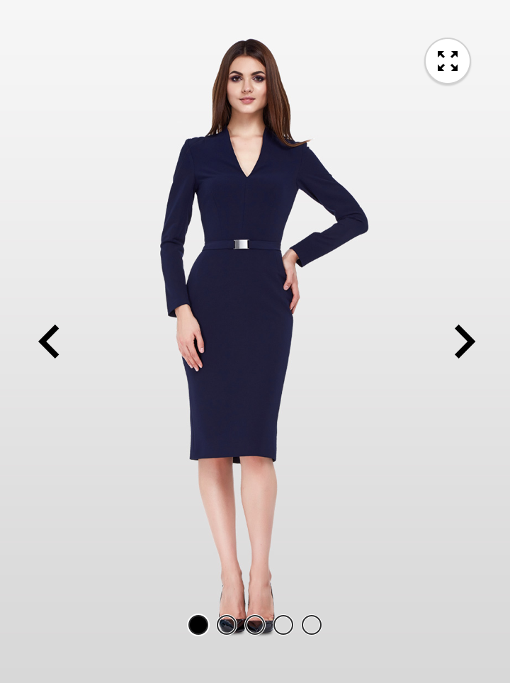
| Description |
Reference image |
| Image carousel |
 |
General Interactions
- Swipe - Moves the carousel image to the right or left based on swipe direction
- Zoom - When user clicks the Zoom icon, a new screen shows up with an enlarged image.
- Tap arrow - Moves the carousel image to the right or left based on arrow direction.
Disabled left or right arrow indicates the beginning or end of the carousel.
- Click - (Desktop only) TBD
- Click + Drag - (Desktop only) Zoom
New arrivals
The new arrivals carousel display images of products that are new to the store.
| Description |
Reference image |
| New arrivals carousel |
 |
Visual specifications
- Contain product-specific images
- Contains a Call to action button labeled See All New Arrivals
- These products do not contain a rating associated with them because they are new.
Interactions
- Clicking on a product-specific image takes the shopper to the product page for that item
- Clicking/tapping on the Call to action button takes the shopper to a filtered page for newly added items.
Recommended items
The recommended items carousel display images of products recommended for a shopper.
| Description |
Reference image |
| Recommended items carousel |
 |
Visual specifications
- Contains 3 thumbnails stacked below the main image with the left or right thumbnail showing half the image.
- A product rating is displayed on the current main image
Interactions
- Swiping the thumbnail row shifts the thumbnails one at a time to the left or right.
The outgoing image is removed from the row, and the new, incoming thumbnail image appears as a half image.
- Clicking/tapping on the main image takes the shopper to the product page for that image.
- Tapping on a thumbnail takes the shopper directly to the product page


